

Bitter/Sweet Scenario Card Game
Creating an original card scenario game and packaging design based off the story of a desired object
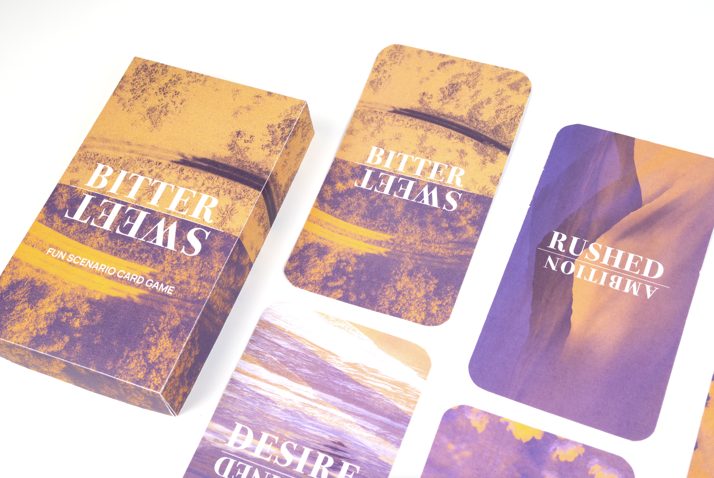
Bitter/Sweet is a fun and interactive card scenario game where you can escape and get up and out into moments worth cherishing with those closest to you. This original card game and visual packaging reflect the themes of hope, grief, isolation and escapism through the story of a personal desired object of mine, The Selection series by Kierra Cass. As a newly branded packaging product, it has been advertised as a point of sale through print media advertising for a young adult target demographic.
Client
Design Project
Location
Sydney NSW, Australia
Timeline
30th October 2023 - 7th December 2023
Role
Packaging, Print Advertising,
Branding & Identity
Tools
Adobe Illustrator, Adobe Photoshop,
Adobe Indesign
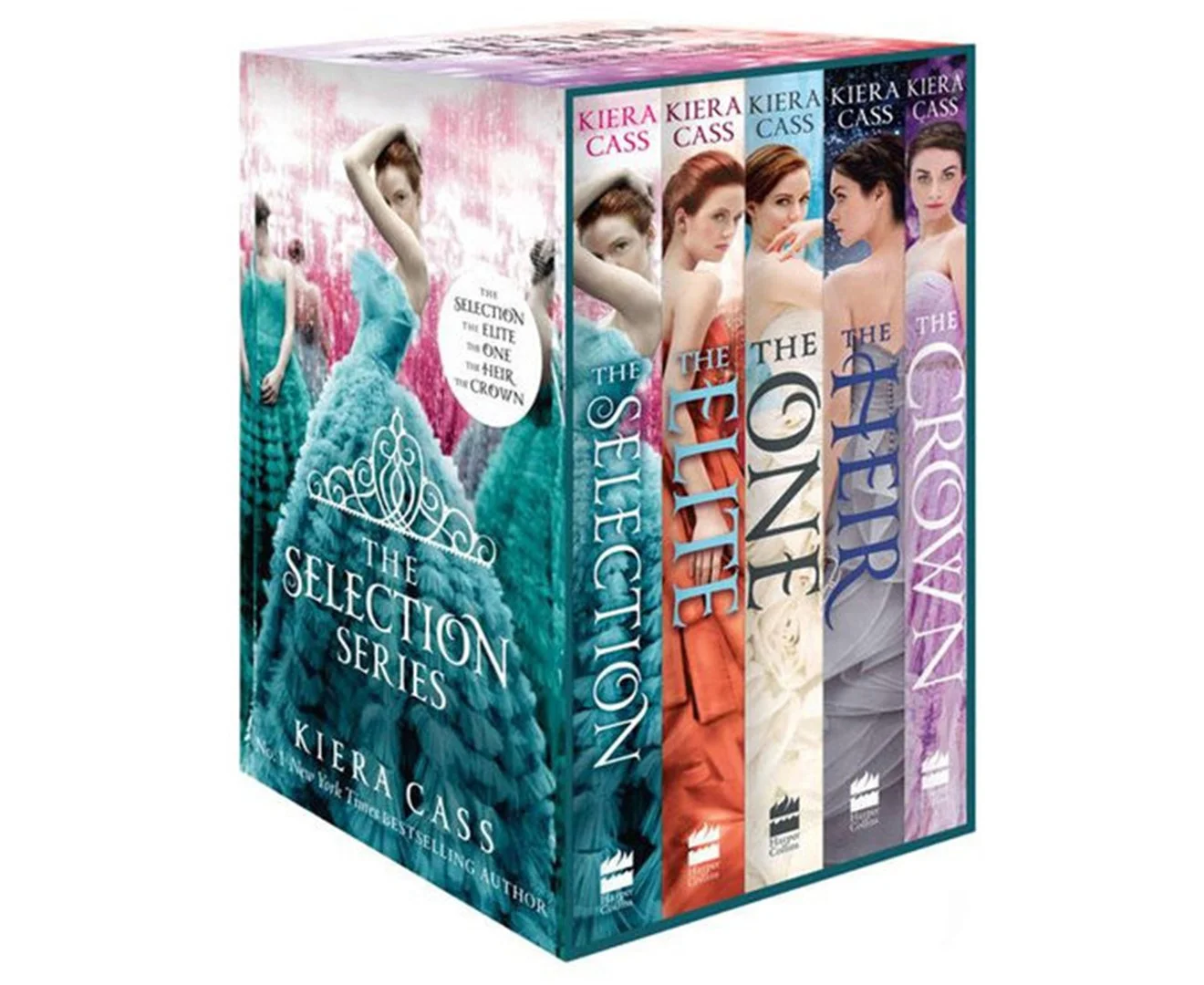
The Selection series by Kierra Cass
Core themes: Hope, Grief, Isolation
CHOOSEN OBJECT OVERVIEW STORY
In the depths of the 2021 lockdown, I stumbled upon Kiera Cass's "The Selection," thanks to my devoted godsister's recommendation. Those days were tough; my godsister was grappling with her father's battle against leukemia, a fight he ultimately lost during that difficult time. Unable to bid him a proper farewell, we all felt the weight of confinement.
Yet, in the midst of that struggle, "The Selection" became my daily refuge. Waking up before my online classes, I'd immerse myself in its pages, finding solace in its fictional world. As I navigated the story's romance, I began to confront my own fears of relationships, sparked by the series' portrayal of love amidst chaos.
The books taught me a valuable lesson about cherishing loved ones, especially during hardship. They reminded me that in our darkest hours, support can come from unexpected places. Embracing the understanding that genuine connections offer unwavering support, I found strength in the solidarity of shared challenges.
CHALLENGE : THE TARGET DEMOGRAPHIC AND STORY THEMES
Drawing from the narrative of my desired object, it explores fundamental themes of hope, grief, isolation, and escapism. To craft a unique and appealing product based on these core themes, I've tailored it for a young adult demographic, targeting individuals aged 20 to 30, including both men and women. Secondary research shows that many people within this age group during the COVID-19 pandemic felt overlooked as they worry they won’t hit important milestones. Isolated from friends, family and missing the opportunity to start their their first career within the working world.
This kind of audience seeks a means to temporarily escape the challenges of work, personal issues at home, or the transition from their family home, all while deepening connections with their loved ones. They relish social gatherings with friends and family, possess a strong affinity for storytelling and game nights, and are adventurous spirits who enjoy camping trips.

Bitter/Sweet Branding Style Guide

SOLUTION AS UNIQUE SELLING PRODUCT
I came up with the solution as a card scenario game, a creative avenue for individuals to engage with and connect deeply with the people they hold dear. This card game is designed for target demographic both men and women between the ages of 20 to 30 years. It serves as an ideal gift bought in-store and advertised through print advertising billboards and magazine pages.
In this game, players have the freedom to conjure up their own stories and venture into different worlds. Each participant brings a unique narrative to the table, be it fiction or based on personal experiences. Building upon the core themes of grief and hope, the game aims to embrace the duality of life, allowing players to interweave both elements into imaginative stories.
The game accomplishes this through its imagery, artfully expressing the juxtaposition of the bitter and sweet aspects of the narrative. It fosters a sense of connection with the audience, facilitating reconnection with oneself and others. In a world often marked by chaos, it offers a sense of belonging and camaraderie.
To align with sustainability principles, the packaging will be printed on A3 sheets of textured linen paper, utilizing a minimalist design that conserves colour. This choice reflects our commitment to eco-friendly practices, using recycled and sustainable paper materials.


OUTCOME
I'm thrilled with the final result and how I transformed the story of my object into a card game. The core themes of hope, isolation, and escapism are beautifully intertwined in this package. Each card reflects different layers of these themes, creating a poignant contrast between the bitter and the sweet.
The dual-tone textured design and natural landscape scenery offer a sense of relief, allowing one to escape isolation and explore otherworldly realms. Through this process, I've gained valuable insights into what constitutes a compelling packaging design, not only in terms of evoking emotions but also in understanding the audience. It's fulfilling to know that this design can inspire consumers to break free from isolation and create cherished memories with their loved ones. In conclusion, I'm delighted with the journey I've embarked on, and seeing this packaging come to life with a story so close to my heart fills me with joy and gratitude.
