

Vinnies Donation Hotspot Mobile Website
Transforming St Vincent De Paul second-hand stores from a dumping ground to a donation hotspot
The Vinnies donation app project targets "The Sustainable Declutterer" - environmentally conscious individuals who donate to op-shops but struggle with finding suitable donation locations. The idea was to rethink the donation space by creating an interactive mobile website that simplifies the process of finding the right Vinnies store for specific items. This solution addresses the challenge of visiting multiple stores due to varying item acceptance policies and overcrowded donation bins. The app provides real-time information on which items each Vinnies store is currently accepting, along with store details, enabling users to efficiently repurpose their second-hand items while supporting sustainability efforts.
General Assembly Team Project | March - April 2023 | UX Research • User Testing • UI Design
Team Members: Charlotte Dodds, Ashley Southwell, Debora Jardim
OVERVIEW
The St Vincent de Paul Society, most commonly known as (Vinnies) is a Catholic non-profit organisation that aspires to help people who are less fortunate through its broad range of services that support housing shelters, domestic violence, organising recreation programs and many more services.
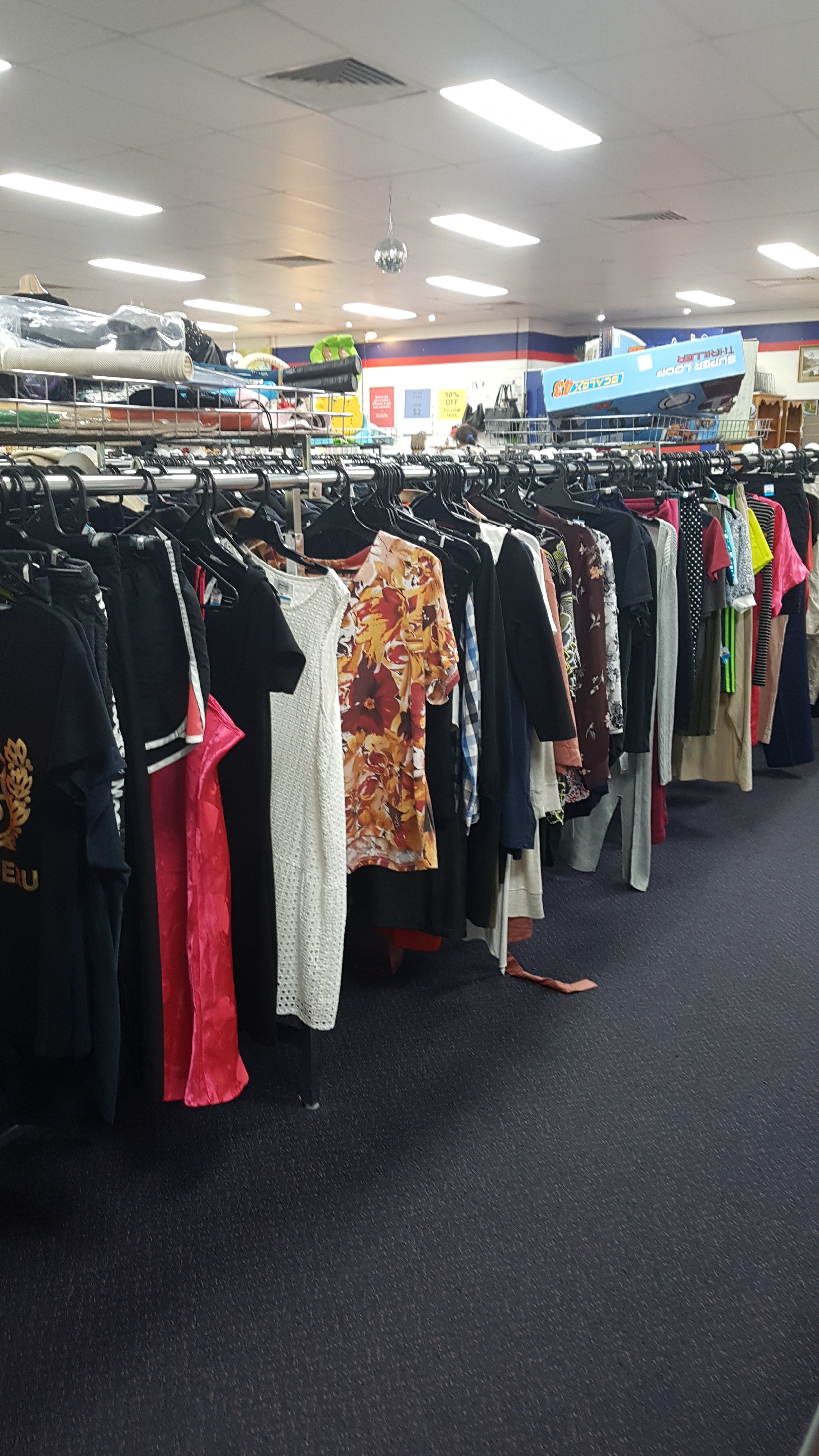
Vinnies is well known for its second-hand op-shops all across Australia nationwide, supporting individuals in need to play their part in saving the planet. The op-shops play a key role in Vinnie’s mission of selling goods at the most affordable prices for everyone to buy. You’re also able to donate any pre-owned items that could be of good use to the community, ready to be bought and reused again.
CHALLENGE
Fast fashion is a worldwide issue and is harming our environment. Vinnies are seeing an increase in fast fashion donations. Even though an increase in public donations may seem positive for Vinnies as a business, the types of items that are given away may be deemed as “expired” or “out of trend” by consumers. There’s an opportunity to build community awareness of fast fashion to attract and reuse more desirable donations to increase sales for the business.
RESEARCH
FAST FASHION STATISTICS
Fast fashion production has doubled worldwide in the last 15 years, with the average person buying 60% more items of clothing than they did in 2000. Australians are the second highest consumer of textiles in the world, buying an average of 56 new items each and sending 23 kg of clothing to landfill every year.
BUSINESS ANALYSIS
We also looked at Vinnies as a business. We found that Vinnies operates more than 409 stores across the country, run by paid staff and a large volunteer network. According to Vinnies NSW’s most recent Annual report, store sales accounted for 30% of their total FY22 revenue, grossing over $57M. We found that Vinnies is a much bigger business than we initially thought, coming up with these 2 core objectives in improving Vinnies as a business to Increase sales and Attract more desirable donations
FAST FASHION STATISTICS
86% have unwanted or unused items at home
91% throw out or donate items to save the hassle of reselling
86% have bought pre-loved items
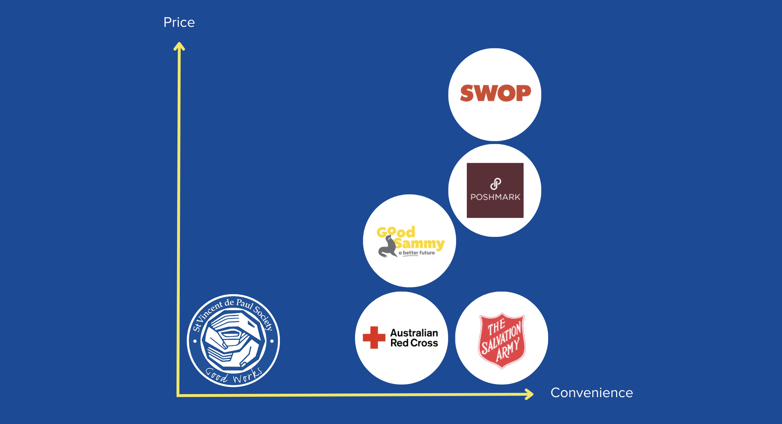
COMPETITOR ANALYSIS
My team and I conducted research into other second-hand thrift stores and budget-friendly fashion retailers to gain a better understanding of where everyday consumers like to repurpose their secondhand items and shop for affordable fashion. We found that Vinnies offers more budget-friendly options, but the lack of an e-commerce platform makes it less convenient compared to its competitors like The Salvation Army, Poshmark and SWOP.


USER INTERVIEWS
The 3 motivations for buying, selling and donating items were to recycle, declutter and save items from landfills.
A potential area of opportunity with 86% identified they have unwanted or unused items lying around their home.
91% of respondents indicated they have thrown out or donated items, to save themselves the hassle of selling it online.
8 out of the 10 people I interviewed donated their second-hand goods through the donation bins provided, mainly clothing being the most donated goods
The most common items bought at a second-hand store are clothing from 40% of the interviews
The main motivation for people shopping at second-hand stores was because the items were more affordable and under the market value.

USER SURVEYS
On Typeform we set up a variety of survey questions where 65 people all across Australia participated where we gathered these insights:
A large proportion donates to declutter/be sustainable
A majority of the age bracket was between 30–40 years of age and female
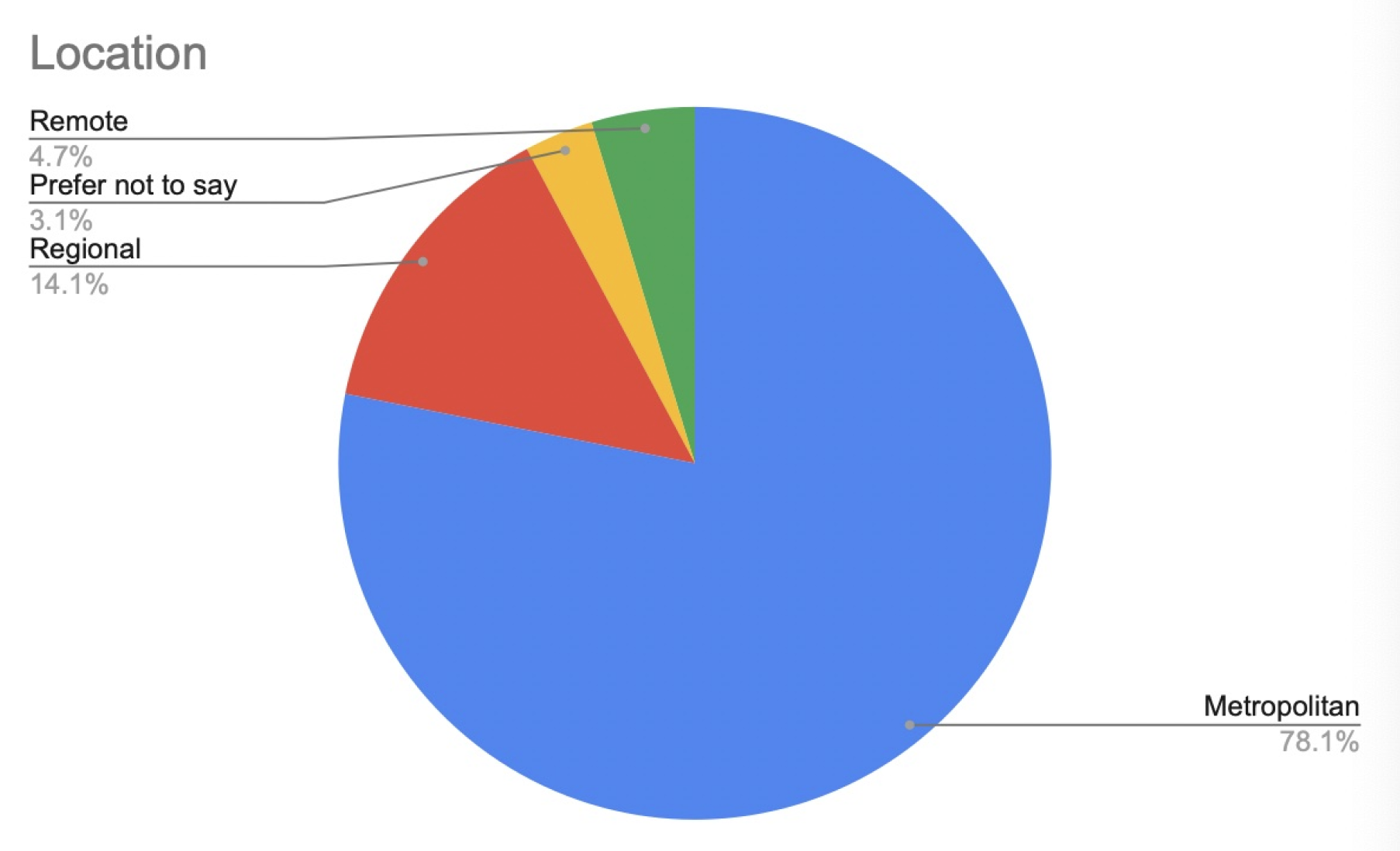
778.1% of participants lived within the Metropolitan areas
43.8% donate and 28.1% buy quarterly at a second-hand store
82% donate second-hand goods
52% donate to declutter
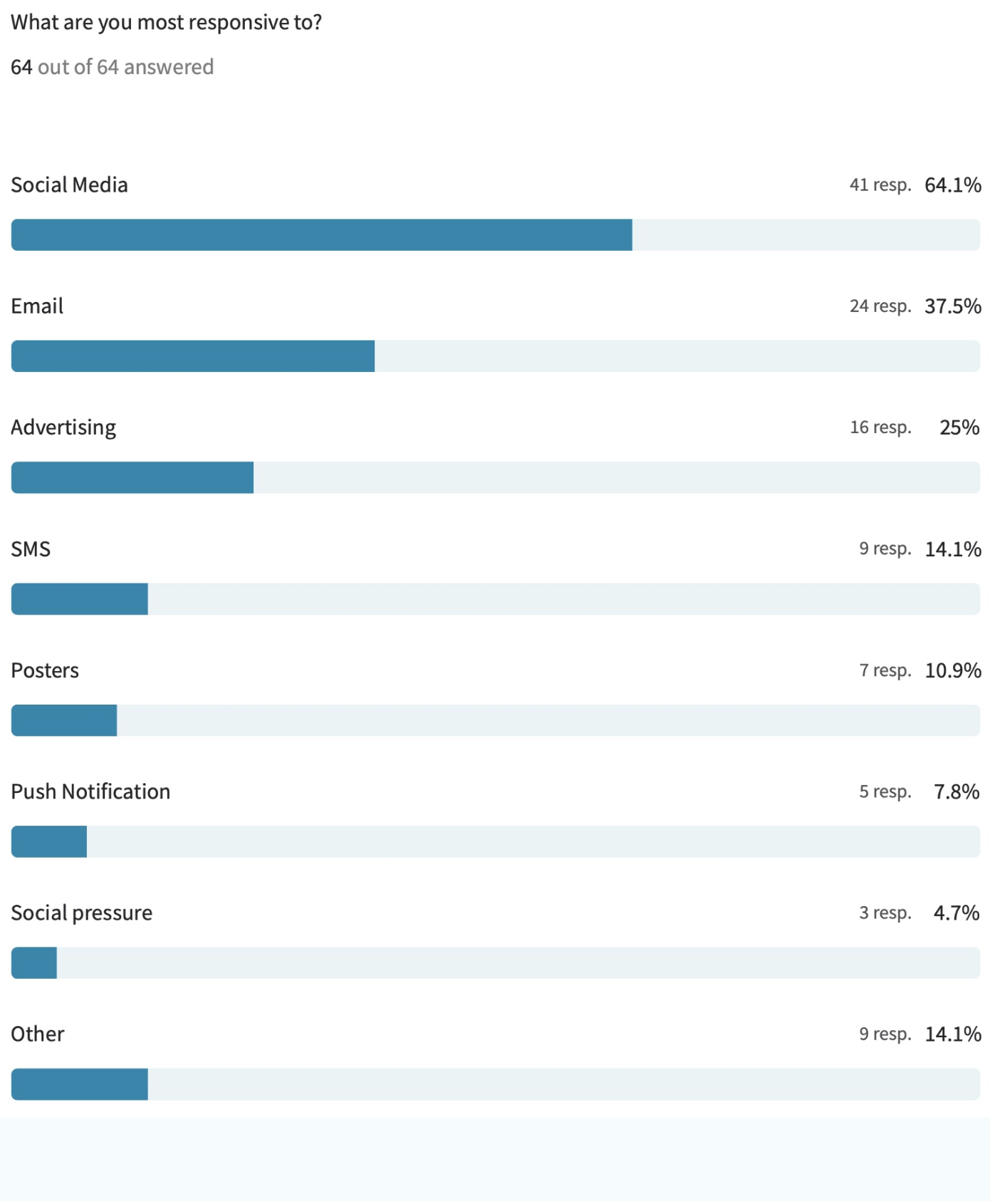
Participants were the most responsive with social media and emails


DEFINE
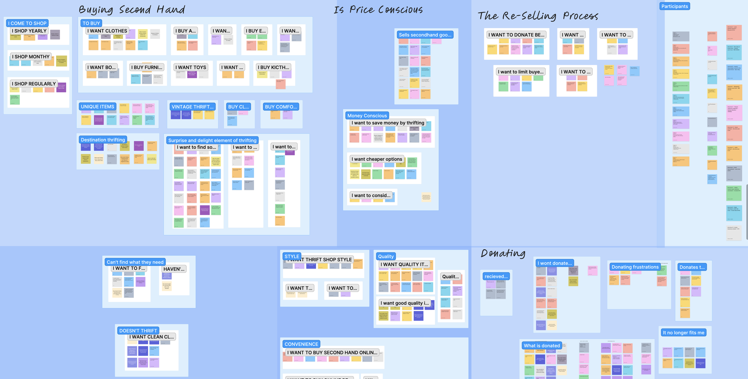
My group and I sorted out our key insights into the Affinity Map, as we went ahead it took us a while to place all our insights in their groups as we went along with it. We found from the most common group of insights we’re buying second-hand, we’re price-conscious and a majority of them have donated items.
We discovered a variety of key trends within our insights we kept in mind for the rest of our design process on this project for both shoppers and donators at second-hand stores.
SHOPPERS
They care about being sustainable in recycling and reusing second-hand goods
They look for items that an affordable and under the current market value
need convenience
Alot of people go to second-hand stores unplanned and usually browse around
DONATORS
People donate items when they want to declutter their personal space
donate items that “aren’t worth reselling”
are frustrated when donating is hard, ie. bins are full/dirty or stores won’t accept certain items
are frustrated by the reselling process
ARCHETYPE

From our extensive trend analysis, we developed the overarching concept of 'The Sustainable Declutter.' Initially, we considered creating a single persona but found it challenging to encapsulate all our research within one persona. With valuable feedback, we decided to focus on a specific area with abundant data: the donating space. Our research centred on a collective archetype – individuals who donate to op-stores with a commitment to sustainability. They declutter to support the environment, but their main challenge is having to visit multiple stores due to restrictions on item acceptance. Additionally, they encounter difficulties when selling second-hand items, especially when charity bins are full or dirty.
THE CORE PROBLEM STATEMENT:
The sustainable declutterer needs to repurpose excess items so that they do not
contribute to landfill
DEVELOP
Donating Journey Map

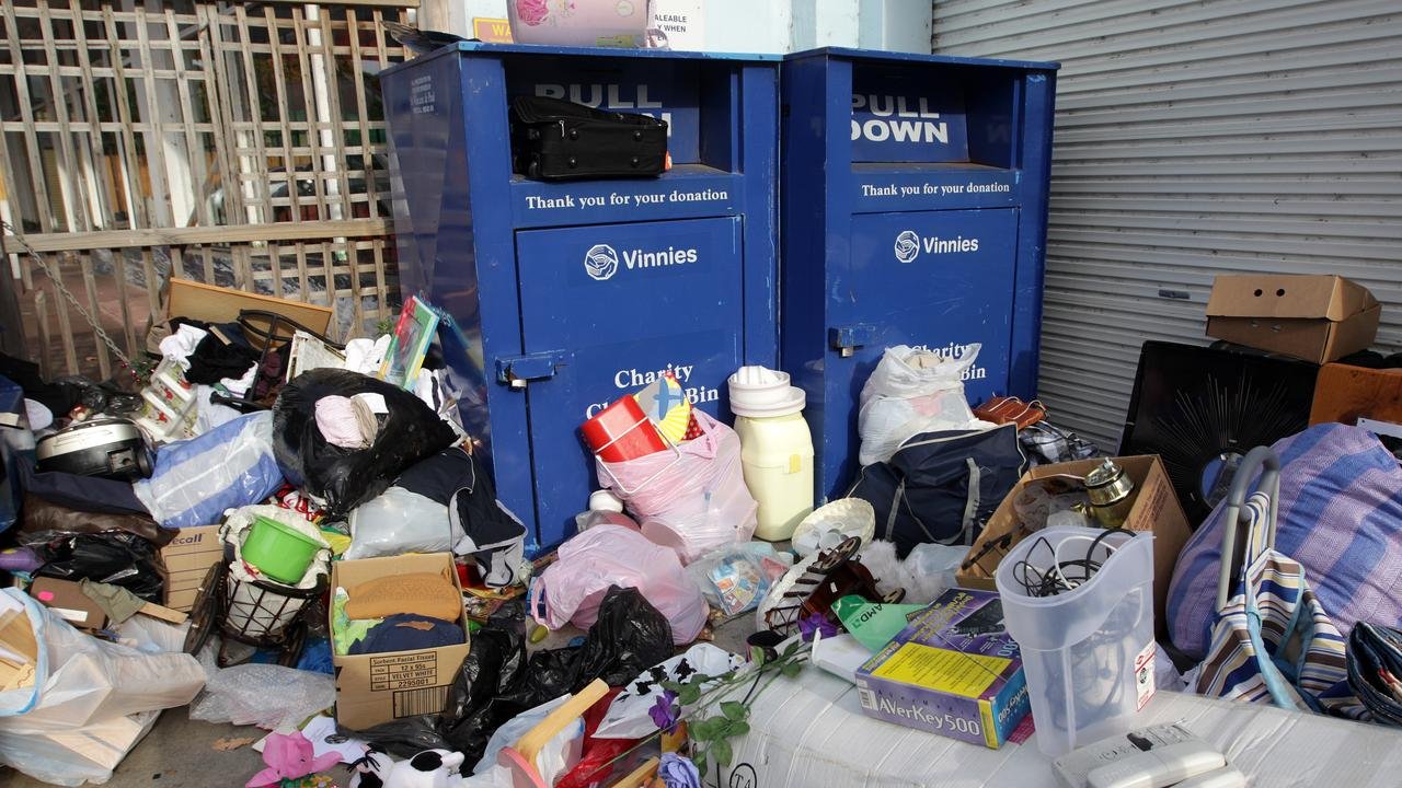
Working on the Donating Journey Map we focus on the more negative and problematic journey a customer would go through when donating items. Wanting to make this journey relatable I split the journey into 5 sections. From the Affinity, the most common way to donate was via a donation bin. With a made-up persona named Sally in a situation where she needs to donate some old clothes, to make it relatable to the user she would be very excited to donate and clean out her space but as she arrives at her local store the bins are full. The problem lies in not knowing if the clothes bins are full or not, leaving Sally the choice to leave the bag of clothes next to the bin with the fear of someone stealing the goods or to take the bag back home and work out another day to donate.
IDEATION
Following our voting process, we identified core ideas to develop further, building upon concepts from Ashley and Deborah. From these core ideas, we engaged in another round of ideation to refine and shape potential product solutions:
Gamified Sustainability: Create a gamified product that allows users to earn points and level up by engaging in sustainability actions, such as donating items, participating in online discussions, and attending events.
Social Swap Platform: Develop a platform where users can connect with others online, discuss potential item swaps, and earn loyalty rewards when they successfully complete a swap, with their points contributing to a loyalty meter.
Interactive Donation Locator: Design a feature that enables users to find nearby donation locations, select a preferred one, and track the donation process through notifications, photos, and videos. Users would receive rewards as a token of appreciation from the stores for their contribution.


OVERCOMING A CHALLENGE
We encountered a hurdle when we realized that Vinnie's website already featured a store locator on a map. Initially, we contemplated changing our concept but recognized an unmet need in bridging the gap between our archetype and the Vinnies community, facilitating open communication between stores and end-users.
THE CORE IDEA: VINNIES NAVIGATION MOBILE WEB PAGE
We debated whether to create an extension of Vinnie's webpage or a standalone product. After revisiting our research and understanding our archetype, we decided that a phone-responsive webpage, also usable on desktop and tablet, would be more practical. Research indicates that most local business customers initially search for information in a regular browser, making responsive web design a valuable tool for connecting with customers without the need for additional marketing or a separate app. Our survey data further supported the effectiveness of email in inspiring user action over push notifications.
MINIMUM VIABLE PRODUCT
A design feature that began to emerge as the most impactful was the application of an interactive map that would allow our archetype to find stores near them that accepted particular items. Reducing the dumping of products outside stores, and charity bins that eventually have to be disposed of due to the impacts of weather and being left on the sidewalk. This will reduce landfill, improve quality donations and in turn increase store revenue.

Testing User Flow
To ensure a seamless user experience, our team initiated a straightforward task flow using Marvel. It commences with a homepage where users are prompted to input their location, select donation items, and subsequently view an interactive map featuring specific store details.

USABILITY TESTS
Usability Scenario: The scenario is, you are looking to declutter your space, you are looking to give away some shoes but doesn’t know where to go.
We conducted 5 rounds of final usability tests on 5 test subjects on our initial user flow designs. Out of the 5 test subjects, only 3 successfully completed the scenario task. This issue with the initial designs was that users commented and hesitated over the words “My location” being present on 3 separate slides. Users said: “Why am I being asked my location again?” and “Haven’t I already entered this?”
This user confusion resulted in an increased task time and reduced success rate.
USABILITY TEST RESULTS
3/5 Test subjects hesitated over each location mention
Improved User Flow
We revisited the drawing board and refined our initial paper prototypes. Subsequently, we conducted further testing during the paper prototyping phase because I recognized the necessity of establishing a solid task flow that could serve as a foundation before advancing to higher fidelity designs in Figma. Addressing these issues during the initial stages ensured that we implemented the appropriate adjustments before delving into the complex Figma mockup.
The outcomes of the second round of usability testing were highly encouraging, with participants expressing sentiments such as "no hesitations" and "Oh, I see that, I think these would be other options."
Feeling confident with the design process, the only concerns raised pertained to clarity, which we anticipated would be resolved in a high-fidelity mockup.


FINAL USABILITY TESTS
We conducted three rounds of final usability tests, with each teammate responsible for one test. The final high-fidelity prototype delivered excellent results for the users. Out of the three final usability tests, users found the tasks significantly easier to accomplish thanks to the subtle changes made in the prototype.
While designing the high-fidelity version with a simplified approach to clarity, we encountered the realization that not every concern can be addressed, especially considering that only 1 out of 5 individuals displayed hesitancy or behaviour, despite successfully completing their usability challenge scenario.
FINAL USABILITY TEST RESULTS
100% success rate from all 3 usability tests
DELIVER


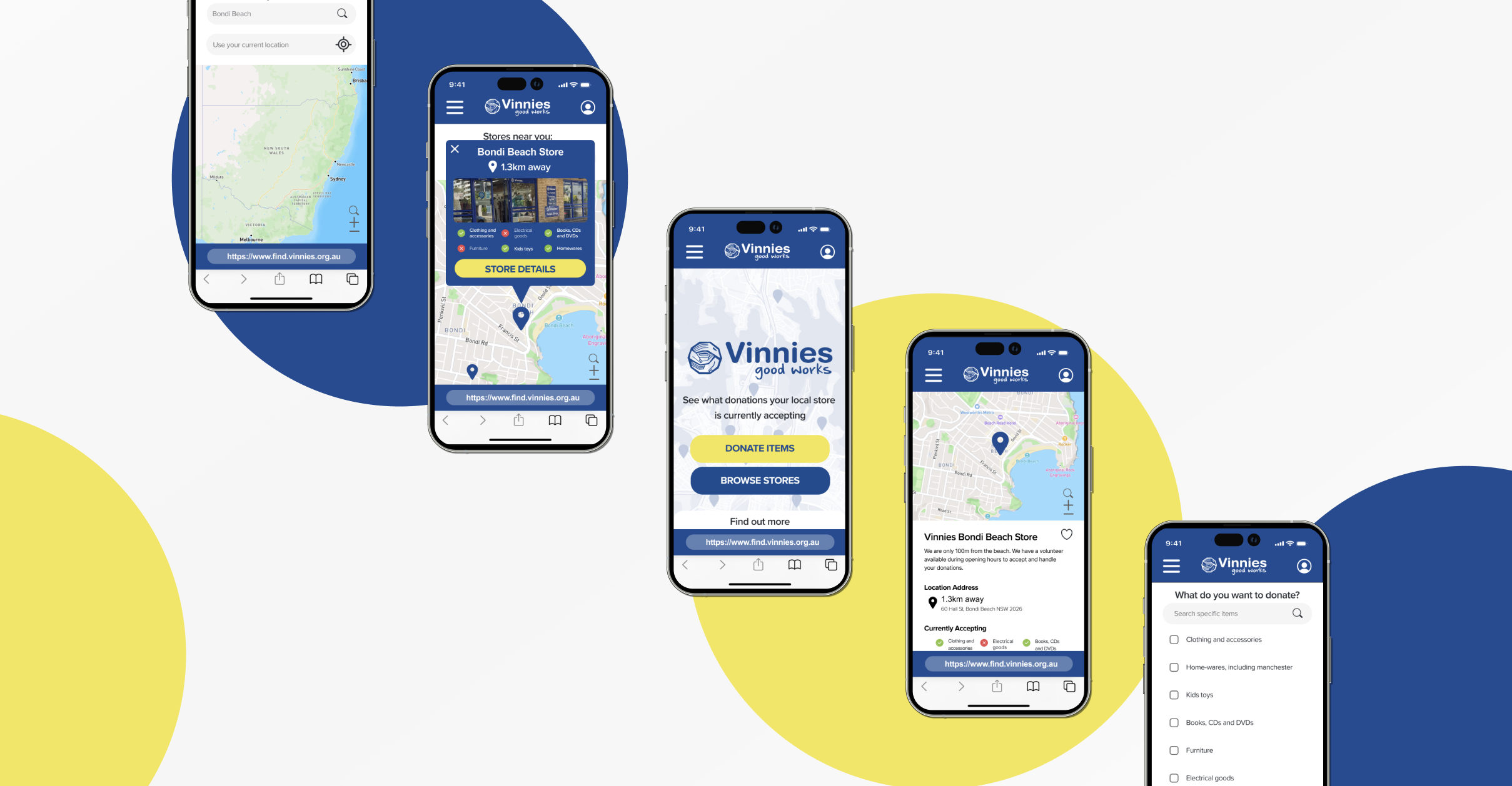
1.
With its landing page you can see the option to, ‘Donate Items’ and ‘Browse Through Stores’ at the bottom of the page so it’s closer to and easier to reach for users.
3.
On the location page you can type in your store on the next page or simply choose a store from the navigation for you. Having the best of both options is great for users whether they are familiar with the area or not.
5.
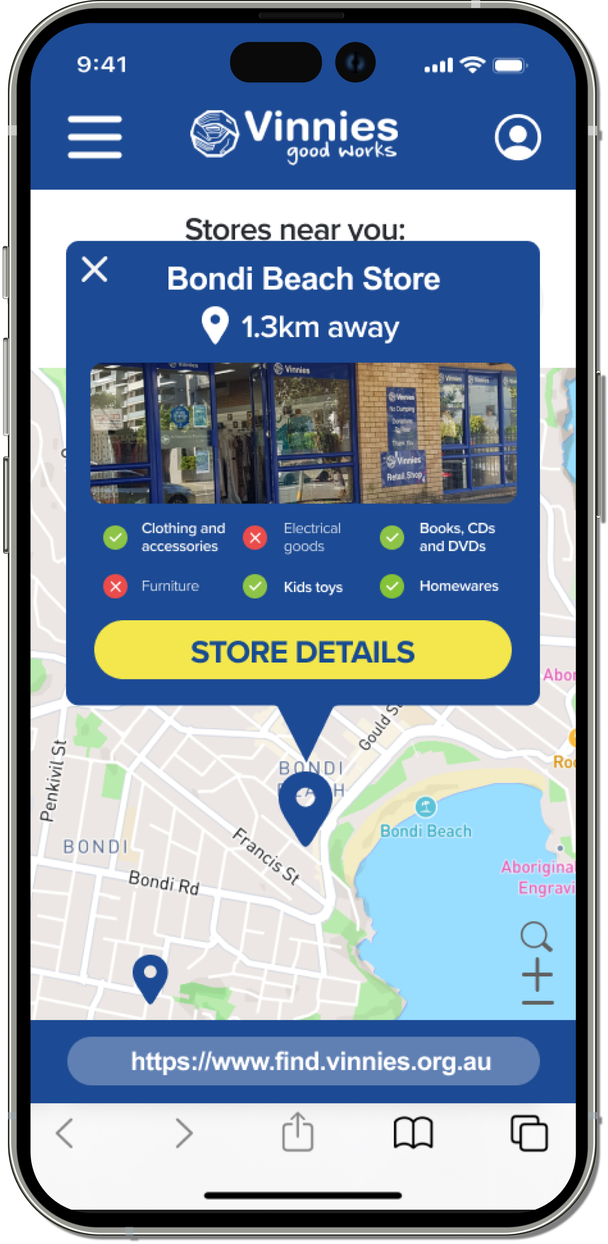
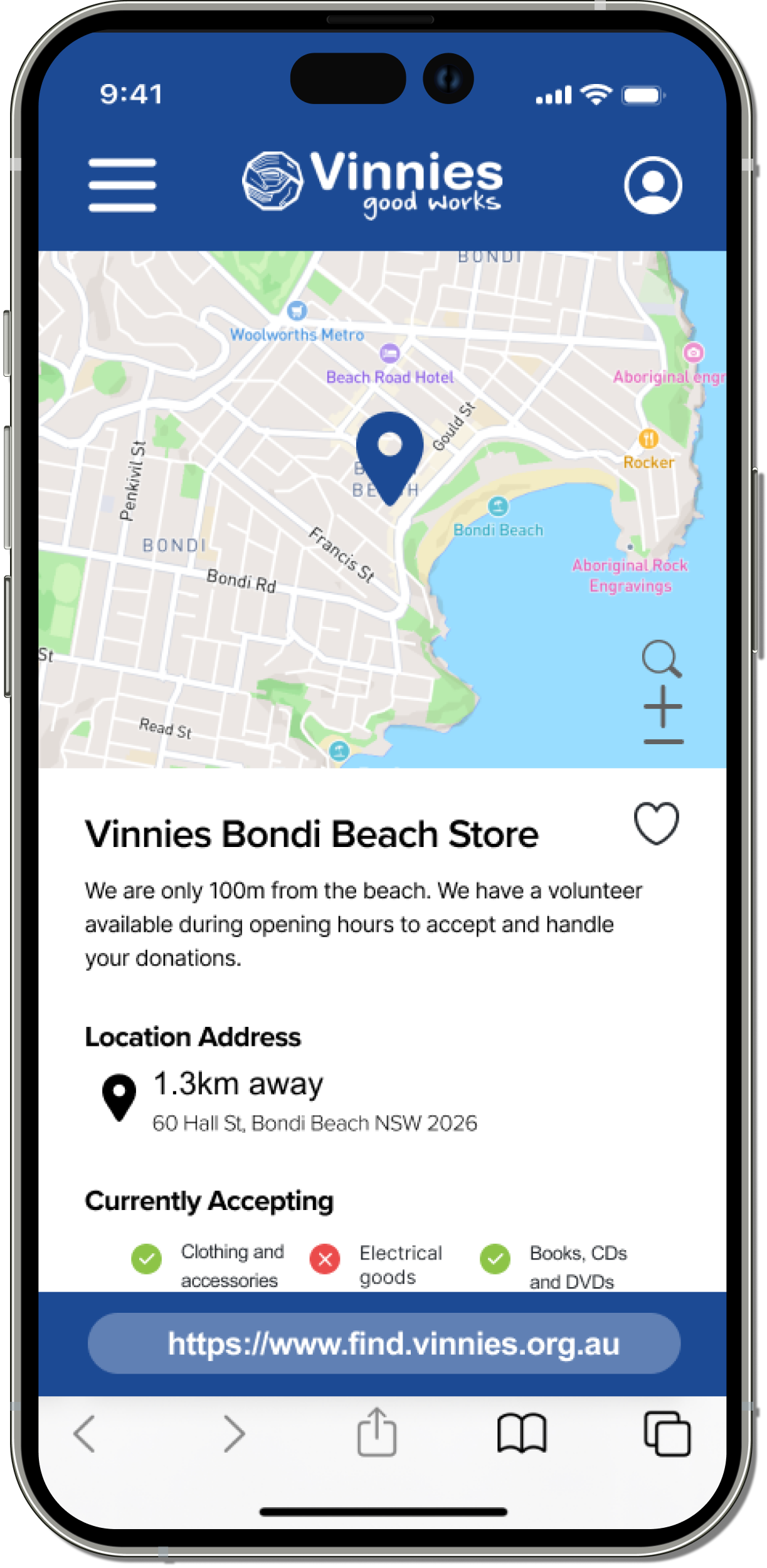
The chosen Vinnies store location shows which items they are currently accepting.
7.
Store details include contact information for any inquiries or additional support you might need. The store's opening hours are also provided for the entire week, allowing users to find convenient times for in-store donations. After reviewing these details, users can proceed to the store to make their donations.


2.
By choosing ‘Donate’ you can filter out and check off which items you would like to donate. Next page to find your location.
4.
When you find your store an icon pop-up appears. Not only did the site give me the closest Vinnies possible to go to, but it also shows the selection of items the store is accepting.
6.
Navigating through the choosen store’s details. From what you can see it shows the map’s location from the top, the store’s short bio on what they do. Its overall location and address give the user directions on how to get to their location.
Prototype Walkthrough
OUTCOME
The overall solution of Vinnies as a product as a mobile-based website was a strong addition to the already existing website. It updates on the already existing navigation system into a mobile website for users to interact and find their nearest hotspot location in order to donate and repurpose your preferred second-hand items. Overall this was a challenging yet exciting new project to take on within a group environment.